I hate to admit it, but I probably spend too much time on social media than I want. I try my best to contain it to when I am aimlessly waiting on an appointment, my wife to finish getting ready before we head out for dinner, or in the bathroom… well you know. Often when I’m scrolling down my feed I’ll come across a sponsored post, or ad for a new clothing company or product, and I’ll become intrigued and tap the “Learn More” or “Shop Now” link.
The times that I do this, these companies have two things qualities that get me to react to their content..
They exist in a product space that I have a high interest, and
They have some good photography
That’s all they need to hook me. So here I go. I land on their homepage, get a good first impression from a hero photograph or carousel, with text, start to organically wonder my way around then…
BAM!
The dreaded Signup Modal Window takes over the screen, and interrupts me. It doesn’t ease it’s way into my experience introducing itself in a mannerly way. No this guy is like a kiosk worker in the middle of the mall, jumping in walk path. I feel like saying, “Hey Man, I just met you. Let me walk around your site for a minute or two, before you ask me for such a big commitment!”
So is this the cost of the web consumer in the current e-commerce space? To deal with these Signup Modal Windows? Having my own Shopify store it’s easy to see where they are coming from. There are many awesome tools that are available on all platforms to help automate and simplify the marketing process of a new clothing, or product startup.
I believe a lot of these occurrences are happening here. I myself had an internal dilemma on whether or not to implement this pattern into my own ecommerce store. Keeping your customers updated on your latest products can do great things for the bottom line, but getting their email address in itself is challenging. Which brings us full circle on these Sign Up Modals. They often work, and it’s easy to spot the bad ones, however let’s take a look at the companies who are doing clever things to get your email address.
Primitiveskate.com with the Gamification

I love this one. It’s a great combination of gamification and reward. I’m a fan of this brand already, and just from a product designer standpoint I was intrigued on how the spin would look. If the visitor wants to skip this, they even implement one last positive reinforcement with the close button with the text “No, I like paying full price”. Good design solution when the business requirements state you have to have a Signup Modal Window.
RealyGoodEmails.com with Full Transparency

Hey, they’re not beating around the bush and just telling your straight up what they want. I would venture to say they have an advantage with their site visitors as well. If you’re going to ReallyGoodEmail.com you’re probably a marketing content person, or designer. They take a little extra care in their Modal Window too, having it take up very little space tucked in the lower left corner of the screen. Nicely executed.
Canva with the stylish opacity
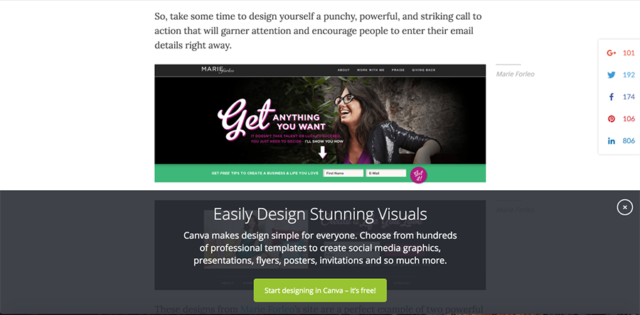
Canva was actually the first search result on google when I was researching for this blog. And although they pointed out some great examples on this very subject, the fork in the road between us was the majority of the Sign Ups they pointed out took over the whole screen. It was nice to see that they didn’t do this themselves though. Their sign up floats at the very bottom of the screen and allows the visitor to keep scrolling. Their headline in the sign up is very compelling and to the point, and the end with a nicely colored CTA button. Good Stuff.
Gary V makes it a section of his site

It rests right under his hero image. Gary delivers such high received content and has a loyal fan base, its one main reason visitors come to his site. I would wager to say that this implementation better serves Gary’s visitors. It also keep the control of the site in the hands of the visitor without there being a Modal Signup Form.
OptinMonster with Exit-Intent
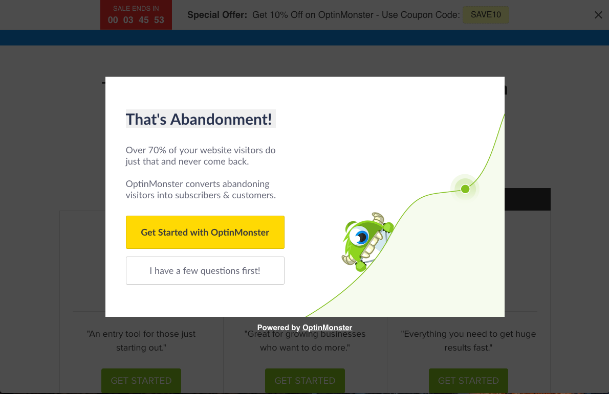
OptinMonster is a lead generation software that creates Sign Up Modals, Full Screen Welcomes Gates, Floating bars and other implementations. One of their feature products, which they also have on their site is a Sign Up Modal that appears when the visitor performs an action that signals intent to leave the site. This lets the visitor wander freely engaging in the content, and right before they leave they are presented with the option to give their email address.